Enhancing User Experience with Simple Format Changes
Working with a client to breathe new life into their Moodle site, I focused on improving user experience through effective formatting changes. We kept all existing video and online content intact but revamped the entire site with a new course theme and consistent formatting to make navigating their online courses simpler and more intuitive.
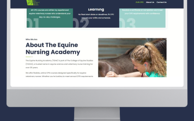
From Classic to Modern: A Side-by-Side Comparison
In the comparison, you can see how shifting from a classic Moodle format to a modern, cleaner theme makes a world of difference for learners. The classic Moodle setup often suffered from the infamous “scroll of death,” where learners had to endlessly scroll through long lists of content and activities, leading to frustration and disengagement. The new layout eliminates this issue by organising content into manageable, clearly defined sections.
The updated theme features a more organised, visually appealing structure that encourages exploration and reduces the cognitive load on users. Key elements are now clearer and more accessible, ensuring students spend more time learning and less time figuring out where to find what they need.
Next Steps: Bringing the Experience Across All Courses
The positive changes we’ve seen with the new theme have set the stage for further development. The next steps involve redeveloping the online content to align with the improved structure and applying this new theme across all of the client’s courses. By doing so, we’re looking to create a consistent, engaging experience for learners across the board.